

Goal
I worked closely with several designers from the Assistant team (Adrian, Woonji, Remington, Ye, Johnathan) to help establish the vision and design language for Google's Assistant.
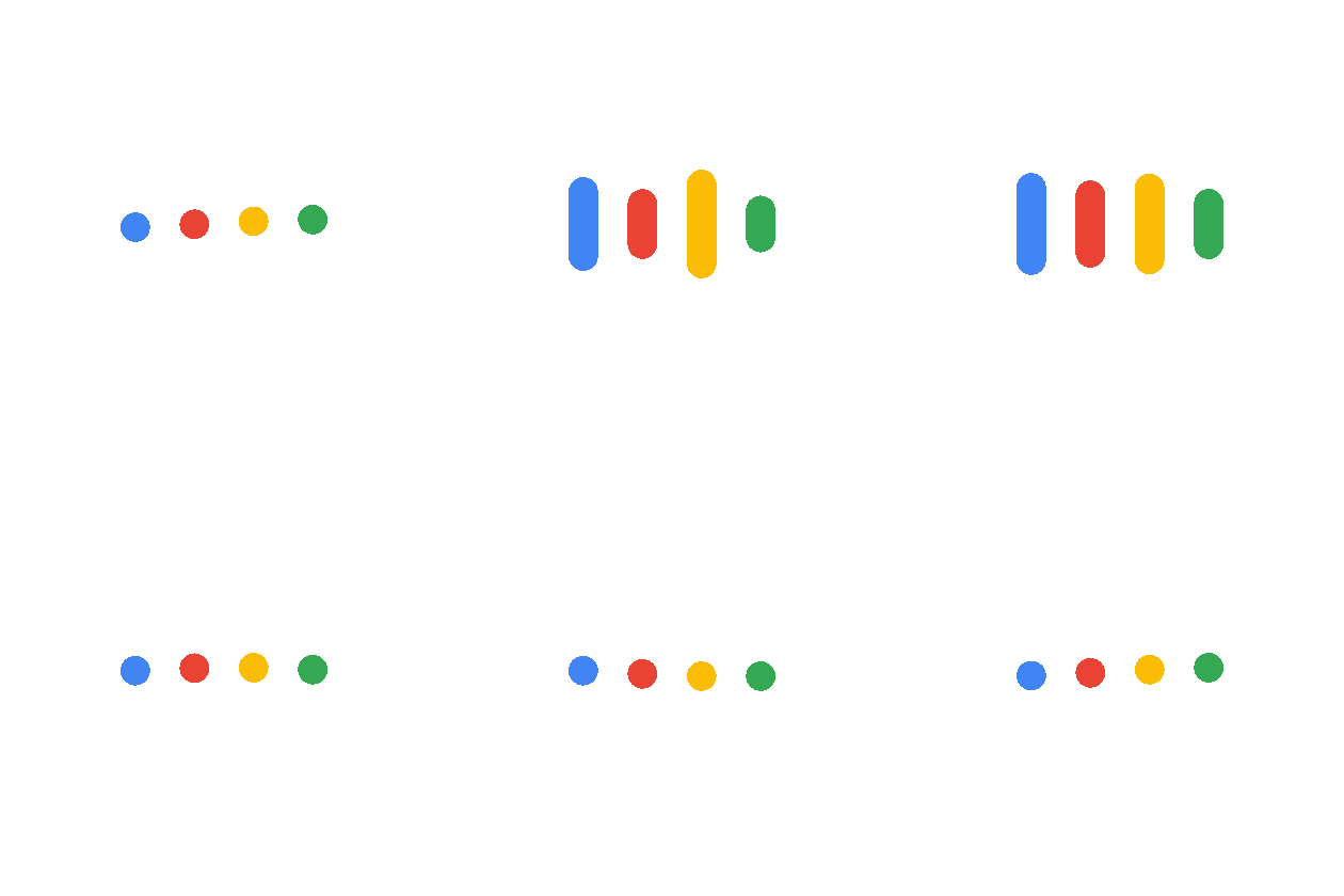
We had 3 core design goals we set out when thinking about the Assistant:
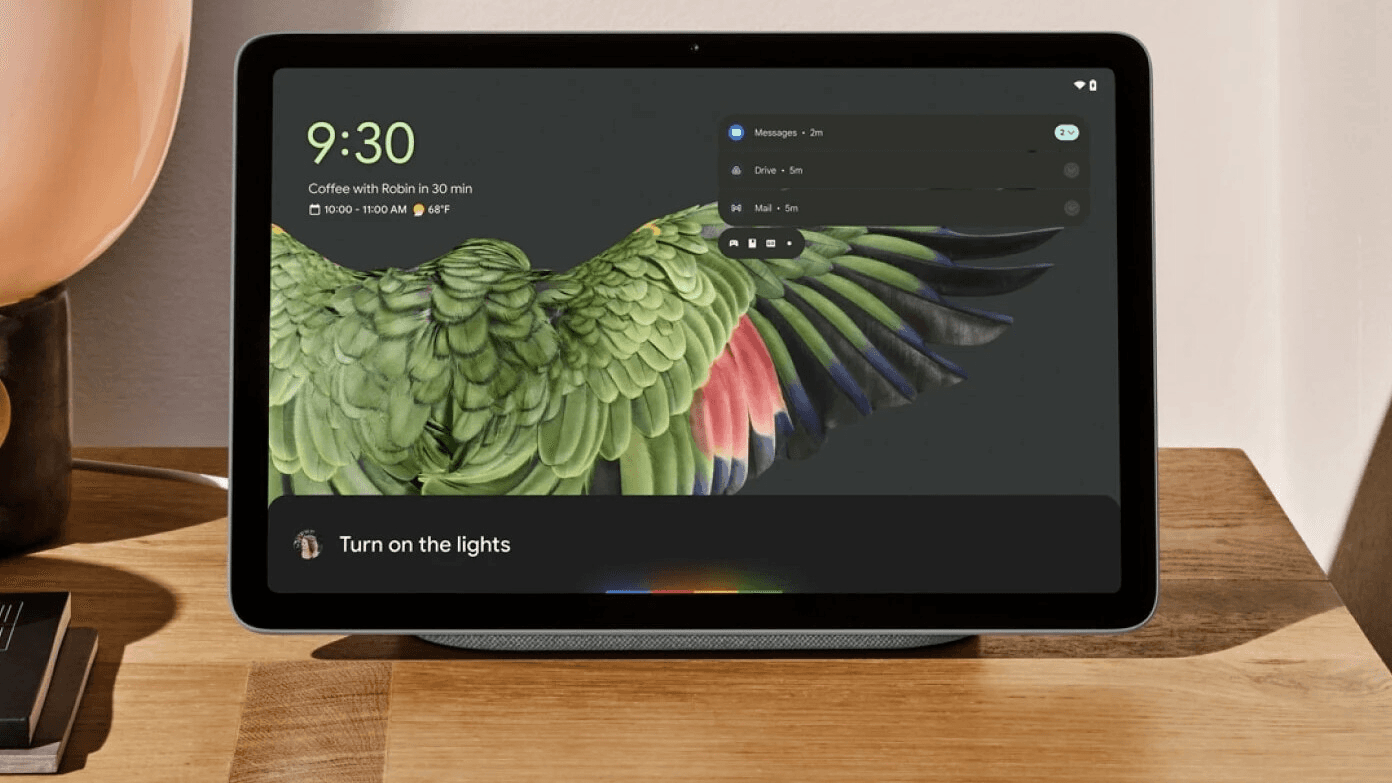
Adaptable (Scalable to different devices)
Preserve context (Lightweight and enable follow-up conversations)
Easy to access (Consistent way of engaging with the Assistant)
Establishing a coherent spatial model was critical to understand how users engage with the Assistant. Prior to this, the Assistant was treated by Android as an app and would appear in the Overview.
Early one we organized a cross-functional/cross-org sprint to generate and brainstorm ideas in this space. Although we had several candidates that we considered, many of them restricted the Assistant to a space (background layer, status bar, etc), which ultimately clashed with the direction we saw the Assistant moving towards.
I built a prototype to demonstrate how the Assistant could be implemented on a system level across Android. That prototype was demoed to leadership which ultimately gave the green light to launch the new minimal Assistant design language.
One of the core principles we sought to do is to make the experience as minimal as possible on Android. This was to ensure users were able to have the Assistant interact with the screen content if they needed. We matched the experience (light/dark) with the background of the context they were in.
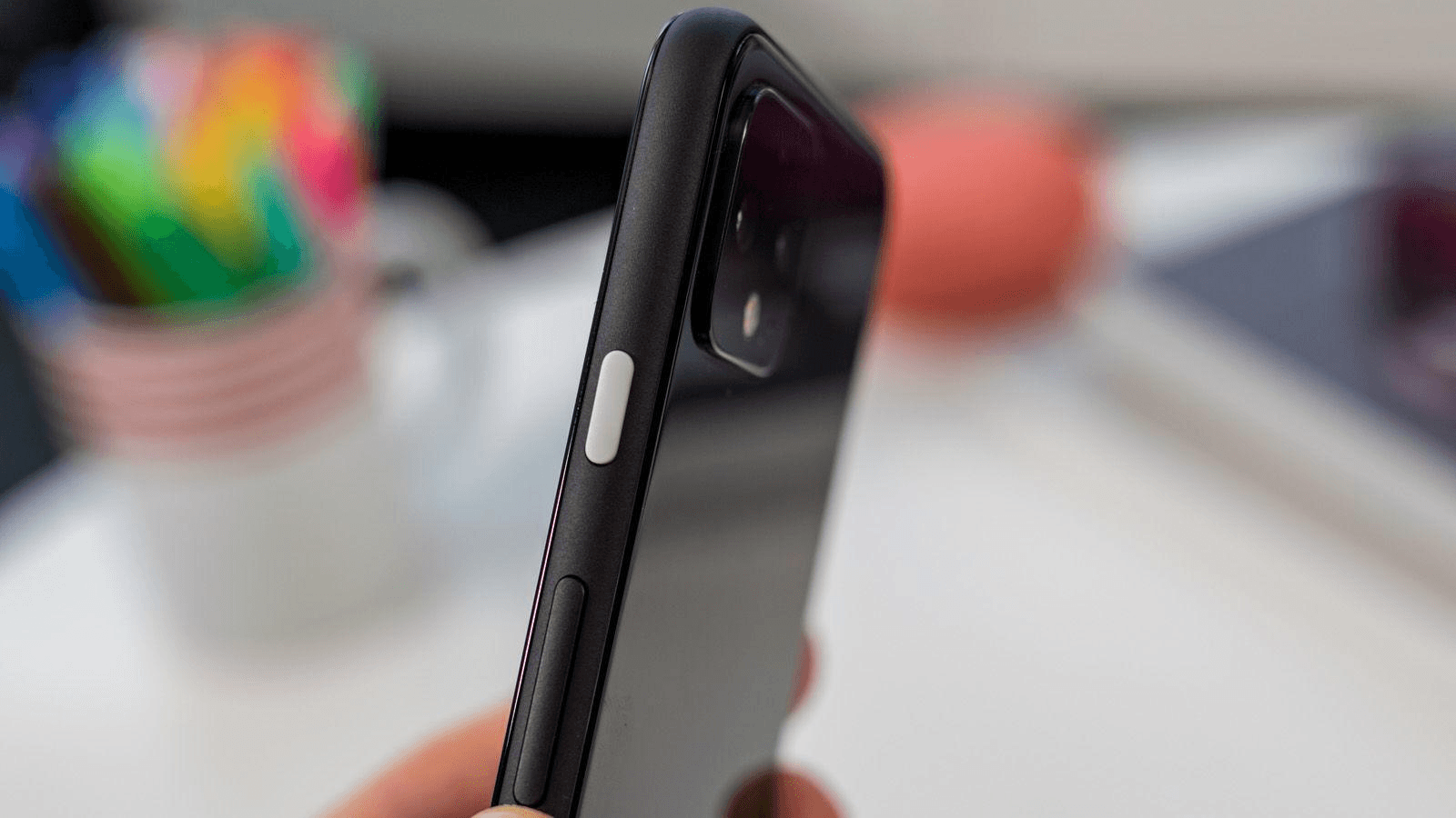
In the past, users would hold down the home button on the 3 button navigation bar to invoke the Assistant. As we continued to give more real estate back to users, we had to provide an alternative to invoke the Assistant. We looked at several gestures to enable this (corner swipe) but ultimately landed on the long press of the power button.
This also required working with our OEM partners to ensure that our hardware button strategy (not just the Assistant) was in alignment since every Android manufacturer took a different strategy.
The New Google Assistant launched alongside the release of the Pixel 4 and continues to be a priority for the company. This new design has scaled to Pixel watch, foldables, tablets, TV, nest hubs and more and continues to be the foundation for Google's long term strategy of a deeper more personal Assistant.


