Background
Background
Background
Project
Project
Project
Role
Role
Role
Year
Year
Year
Android
Android
Android
UX Lead
UX Lead
UX Lead
2017-2021
2017-2021
2017-2021
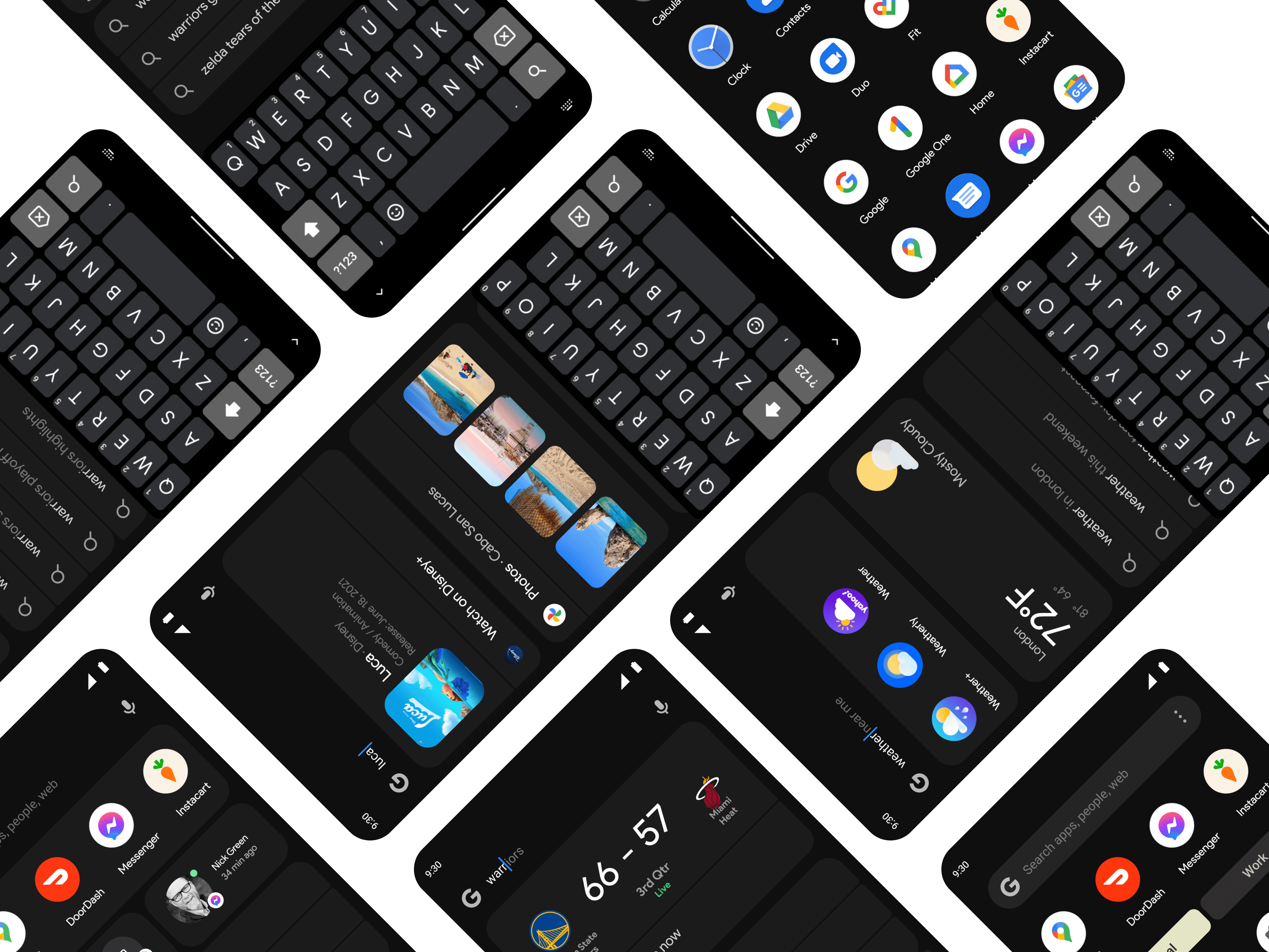
Traditionally, the Google search experience was solely a web experience that would only act as a text based auto-complete. Android had a separate on-device search that allowed users to only search for apps on their phone. We sought to unify and improve these two disjointed experiences.
Traditionally, the Google search experience was solely a web experience that would only act as a text based auto-complete. Android had a separate on-device search that allowed users to only search for apps on their phone. We sought to unify and improve these two disjointed experiences.
I led the UX for Android's native on-device & web search.
Traditionally, the Google search experience was solely a web experience that would only act as a text based auto-complete. Android had a separate on-device search that allowed users to only search for apps on their phone. We sought to unify and improve these two disjointed experiences.
Deeper search
Deeper search
Deeper search
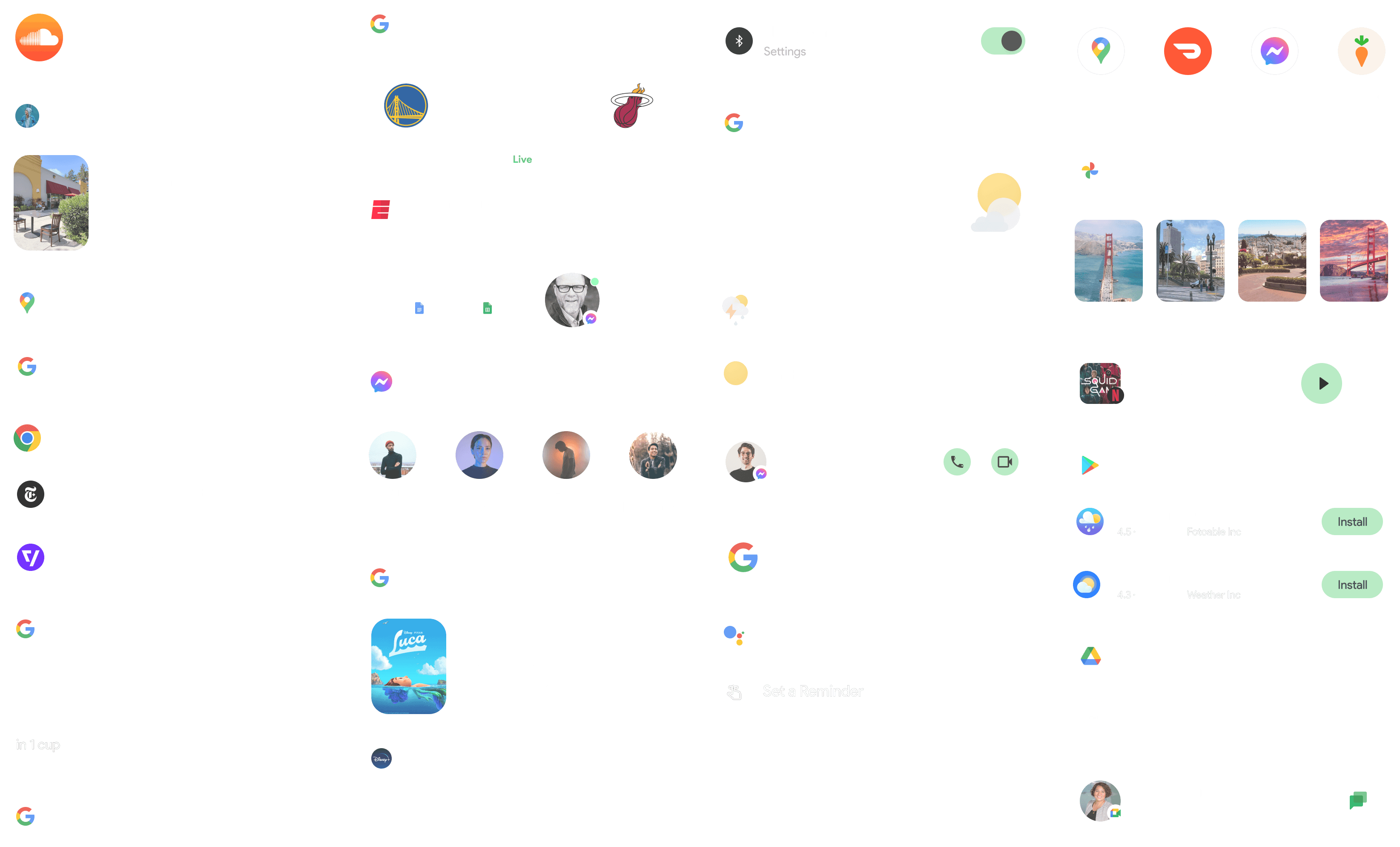
For years, many were accustomed to ending up on the Google search results page whenever they were looking for something. Our outlook was that the search experience is only a bridge to take you where you need to go in the fastest way possible. So we sought to bring a richer experiences that included answers in the search suggest so they didn't have to go anywhere else to find what they were looking for. We also brought deeper in-app search for files, docs, people, and more.
For years, many were accustomed to ending up on the Google search results page whenever they were looking for something. Our outlook was that the search experience is only a bridge to take you where you need to go in the fastest way possible. So we sought to bring a richer experiences that included answers in the search suggest so they didn't have to go anywhere else to find what they were looking for. We also brought deeper in-app search for files, docs, people, and more.
For years, many were accustomed to ending up on the Google search results page whenever they were looking for something. Our outlook was that the search experience is only a bridge to take you where you need to go in the fastest way possible. So we sought to bring a richer experiences that included answers in the search suggest so they didn't have to go anywhere else to find what they were looking for. We also brought deeper in-app search for files, docs, people, and more.



Entry point
Entry point
Entry point
It was critical to have an easy to access gesture into search for our users. In the past, Google Search was a button on the top of the home screen, we moved the searchbox down to bring it within reach for many users and saw a huge improvement in usage/user satisfaction when doing so.
We also introduced a swipe up to access search results right from the home screen.
Prototype I built to test interactions between Search and All Apps
Prototype I built to test interactions between Search and All Apps
Prototype I built to test interactions between Search and All Apps
Extending the search experience
Extending the search experience
Extending the search experience
Android has a growing ecosystem of devices with different manufacturers so we partnered with them closely to craft the google search experience that would fit for their devices.
Android has a growing ecosystem of devices with different manufacturers so we partnered with them closely to craft the google search experience that would fit for their devices.
Android has a growing ecosystem of devices with different manufacturers so we partnered with them closely to craft the google search experience that would fit for their devices.




Outcome
Outcome
Outcome
With ongoing improvements for a wide range of answers, actions, and in-app search, Android on-device search continues to be a core surface area for users to launch and find what they are looking for.
With ongoing improvements for a wide range of answers, actions, and in-app search, Android on-device search continues to be a core surface area for users to launch and find what they are looking for.
35%
25%
increase in access to Searchbox when compared to the old design
increase in access to Searchbox when compared to the old design
increase in queries when compared to the old design
increase in queries when compared to the old design
"The achievements I'm most proud of are the things we did in partnership with other groups at Google. Standouts for me include the wonderfully slick integration of Google Search and Pixel Launcher (in partnership with the Search team)"

Dave Burke
VP, Android
"The achievements I'm most proud of are the things we did in partnership with other groups at Google. Standouts for me include the wonderfully slick integration of Google Search and Pixel Launcher (in partnership with the Search team)"

Dave Burke
VP, Android


