Travelocity
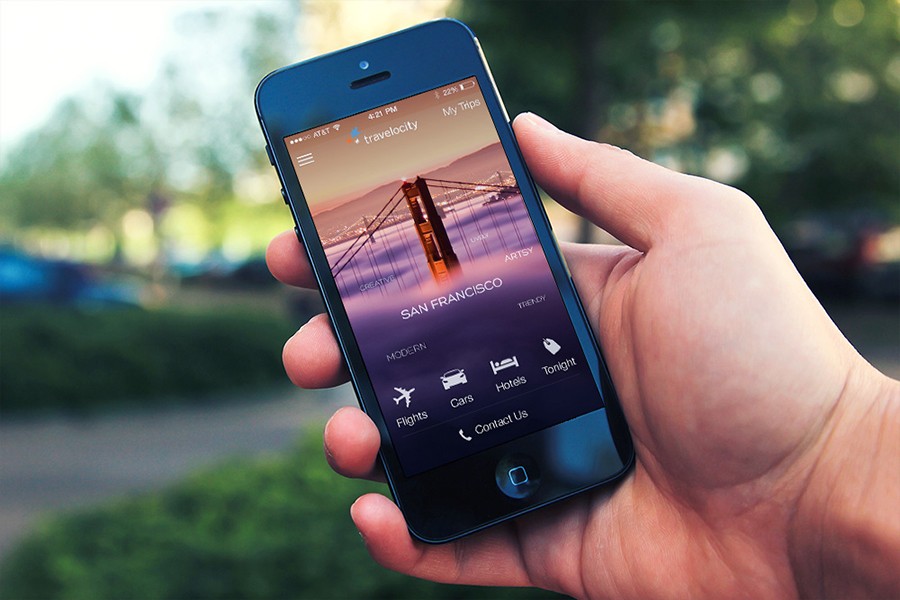
I led the redesign of the Travelocity App for iOS and Android
Travelocity
I led the redesign of the Travelocity App for iOS and Android


Featured
by Apple
Featured
by Apple
Featured
by Apple
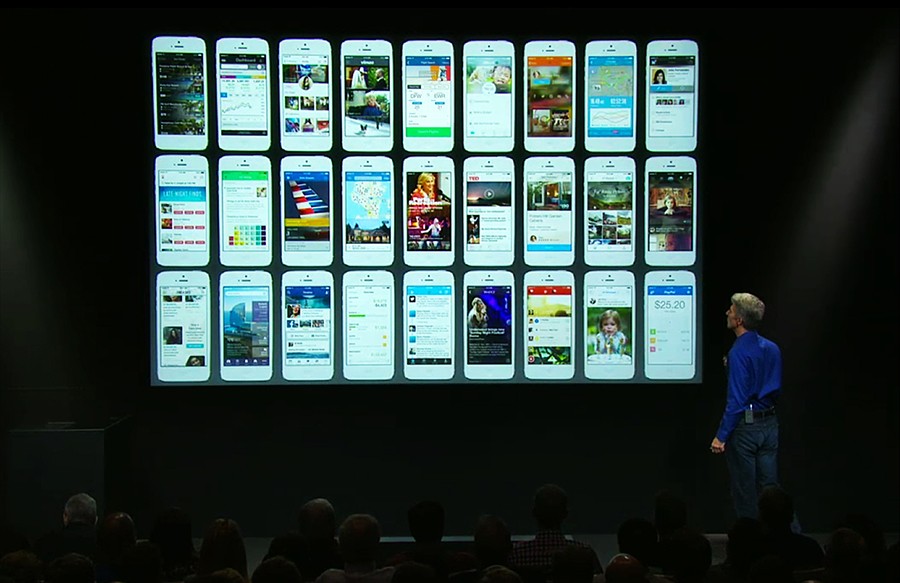
Apple featured the redesign in their Special Event that just took place on September 10th, 2013. They featured our app along with a few others like Facebook, Twitter, Path, LinkedIn, etc.(It is the fifth screen on the first row)
Apple featured the redesign in their Special Event that just took place on September 10th, 2013. They featured our app along with a few others like Facebook, Twitter, Path, LinkedIn, etc.(It is the fifth screen on the first row)
Apple featured the redesign in their Special Event that just took place on September 10th, 2013. They featured our app along with a few others like Facebook, Twitter, Path, LinkedIn, etc.(It is the fifth screen on the first row)


Brainstorming
& Sketching
Brainstorming
& Sketching
Brainstorming
& Sketching
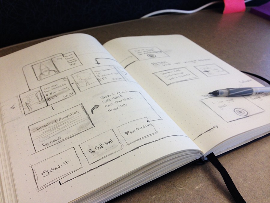
I was hired at Travelocity to be the lead of all of our native applications for mobile. The apps that were currently available had many issues with them, they were designed without the customer in mind, unstable, and the last design change was about 4-5 years ago. We gathered several requirements and ideas that we wanted to incorporate in to the app, followed by making a road map for development.
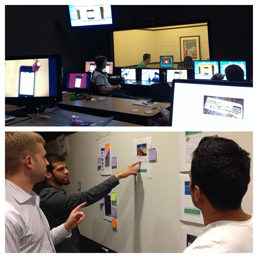
This process went through many iterations of low and fidelity wireframes as we solidified a direction that we wanted to take. Shortly afterwards I created a prototype of the app to start testing functionality in front of customers.


Prototyping
& Research
Prototyping
& Research
Prototyping
& Research
We had a Usability Testing Lab on site which we would frequently use whenever we wanted to test out our products. We tested out the prototype and updated it as we got the feedback, which in turn allowed us to continually improve the product.
We would perform some A/B testing comparing the old design with the new design to ensure we were improving on the existing experience and not hindering it. The idea was to make sure that we had consistency across all mobile platforms (Android, iOS, Mobile Web); Basically a user of any device could easily pick it up and use it without having to relearn interactions or where things are placed.
iOS 7
Transition
iOS 7
Transition
iOS 7
Transition
A few of us, including me, had the opportunity to attend WWDC 2013. Upon hearing the new direction, we had decided to halt development and rework the existing design to have a very iOS 7 look to it. Given the fact that we found out in the middle of June (with an expected release in September), we needed to determine the new direction rather quickly. Comparison of iOS and Android designs prior to the design change.
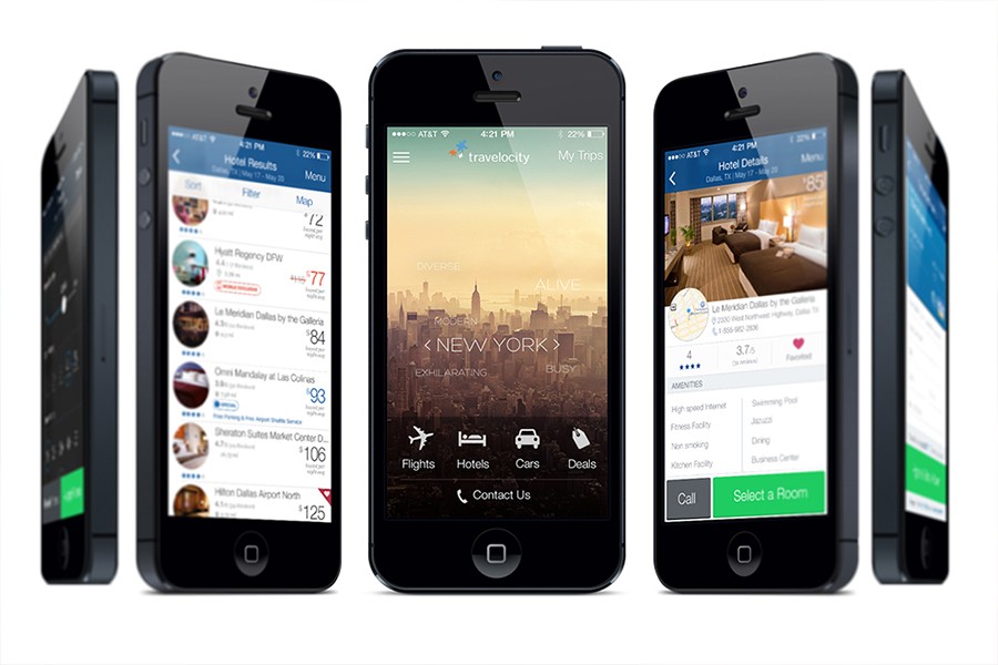
I went through Apple's UI documentation as well as noted all interactions, patterns, styles, layouts that were used by Apple in their beta. I was able to rework our current design, incorporating what we had learned from our usability testing and research, to ensure we had ample time for development.


Outcome
Outcome
Outcome
We successfully launched the app redesign and it featured by multiple blogs and even Apple at their developer conference. Travelocity saw a sharp increase in number of MAUs and in completed bookings.
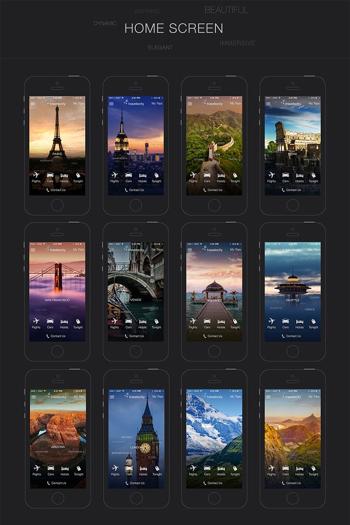
More screens can be viewed here.
We successfully launched the app redesign and it featured by multiple blogs and even Apple at their developer conference. Travelocity saw a sharp increase in number of MAUs and in completed bookings.
More screens can be viewed here.
We successfully launched the app redesign and it featured by multiple blogs and even Apple at their developer conference. Travelocity saw a sharp increase in number of MAUs and in completed bookings.
More screens can be viewed here.


Google
Glass
Google
Glass
Google
Glass
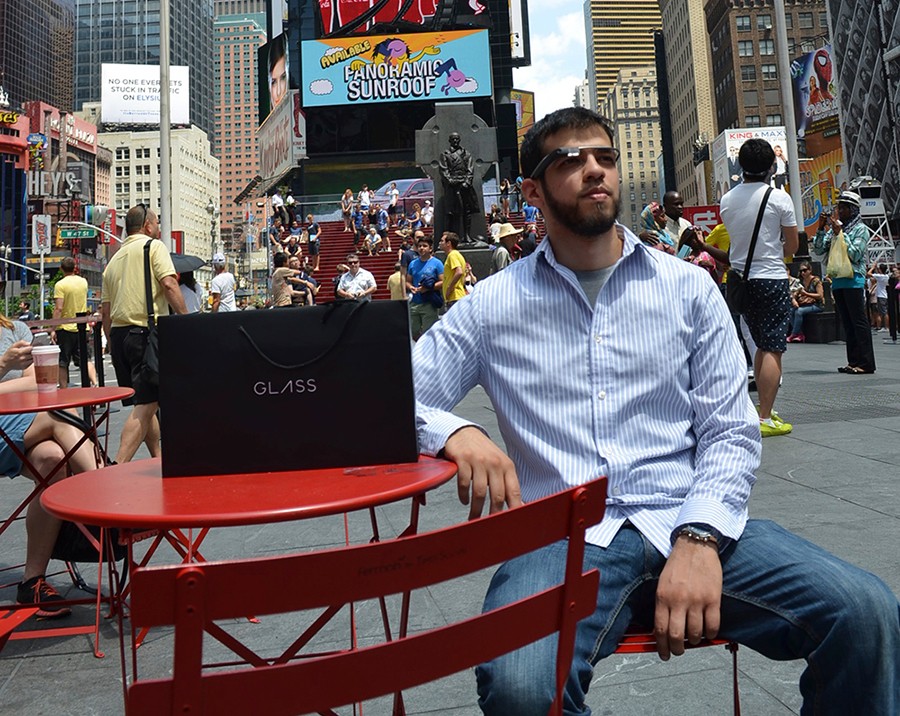
I was selected to participate in the Google Glass explorer's program where I led the design exploration for how travelocity's app can adapt for the form factor. The concepts centered around finding & booking nearby hotels easily.
